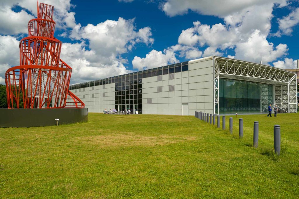
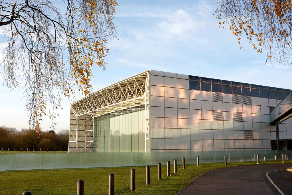
The Sainsbury Centre retains the capacity to surprise and delight, and to challenge expectations of the modern museum. Hovering on the edge of the lush, green campus of the University of East Anglia, the building, with its engineered steel space frame, clad in gleaming white panels and eight-metre high glass facades, is still strikingly modern.
Building the Sainsbury Centre
Norman Foster’s grand hangar is still an example of extraordinary museum design, more than forty years after it was built

The Sainsbury Centre, with Tatlins Tower. Photo: Andy Crouch
Conceived as a single span structure, 150 metres long, it is more aircraft hanger than conventional museum and, once inside, admiration for its engineering gives way to an appreciation of its unique effects of space and light. The architect Charles Jenks observed “the light quality of the ceiling is unlike anything we’ve ever seen before at this scale – shimmering, playful, iridescent, disturbing, like a thousand Bridget Riley optical vibrations laid end to end.” The Sainsbury Centre remains one of the world’s most extraordinary museum buildings.

A challenge to preconceptions
Commissioned in 1974 and opened in 1978, the Sainsbury Centre was built to house the donation of Robert and Lisa Sainsbury’s collection to the then-new University of East Anglia. Robert and Lisa Sainsbury selected a little known architect – Norman Foster. Foster described his first meeting with the Sainsburys, “When with some trepidation, I stepped through the door of the home of Sir Robert and Lady Sainsbury at 5 Smith Square on New Year’s Day in 1974, I did not know the extent to which that first meeting would influence my future as an architect and also my personal life. The building that we created together was to challenge many preconceptions about museums. We selected a location which at that time was on the edge of the University campus, away from the other arts and next to the sciences to encourage the mixing of different disciplines. The Sainsburys shared a belief that the study of art should be an informal, pleasurable experience, not bound by the traditional enclosure of object and viewer.”
The Sainsburys gave their architect a surprisingly open brief and the enormous, adaptable interior, which houses a range of functions from teaching, display and exhibition spaces to cafes, a restaurant and shop, was achieved by locating all the services in the skin of the building – a bold new innovation. The Centre’s design is inspired by Foster’s lifelong fascination with aircraft and, as the critic Jonathan Glancey has observed, the building is “more Boeing than Bauhaus”. Indeed, in a county of large agricultural buildings, of airbases and aircraft hangers, the Sainsbury Centre feels at home: an architectural icon for the region.